AE outfits to AG-ize part two.... thanks for the comments on part one. We think we will look into Miranda's Claire's idea too.... *starts to browse the Claire's website......
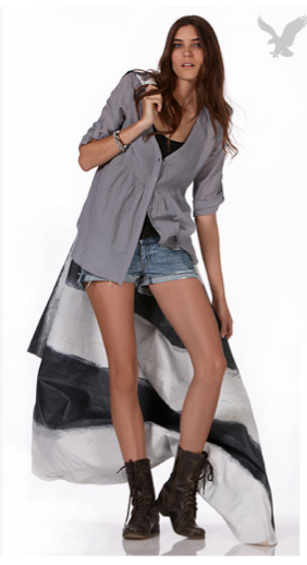
So many intriguing things to this outfit... the semi-destroyed, bleached jean shorts, the cropped vest in a semi-shiny fabric, and especially the drapey shirt under it that cuts down from one shoulder and hangs off the other. A cool look indeedy...
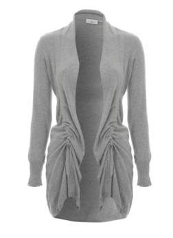
A slightly less splashy look, but these types of cardigans with the gathered, empire-waistline area under the bodice look great.... is there a way to make a pattern for these?... we wonder....
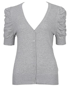
And we also found these cardi variations online... the gathered front and the gathered sleeve looks.... unique possibilities if one could pull it off on AG scale...
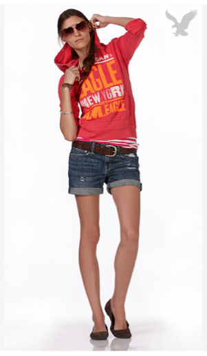
And what do we have here? Nothing too overwhelmingly new... but something people tend to avoid for AGs.... why? we aren't sure...... A nice, lightweight hooded long-sleeve shirt with scrunch-able sleeves (i.e. they can be pushed up).... big lettered, blocky colorful graphics.... rolled cuff jean shorts with a nice thick brown belt to accent the waistline... all good things, right?.....
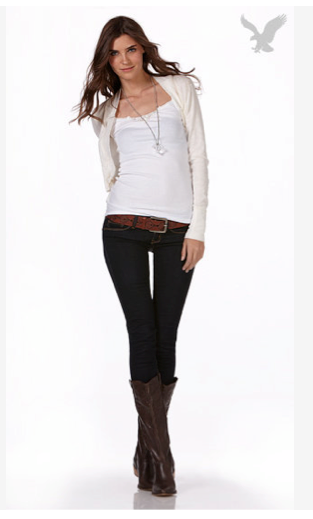
Here is another simple but pretty statement (AE is so good at looks that say "I can dress down but still look elegant")... a white tank top, a cream cardigan, long necklace, dark blue jeggings, red-brown belt, and slim-fit dark cowboy-esque boots...... we are in ♥.....
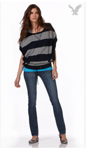
The return of the 80s? Kind of.... but not exactly... first let's address the colors: black and gray stripes, you can never go wrong with that... layering with the bright turquoise, also cool.... and blue jeggings/ skinnies, a great look... of course the top is 80s-esque... but we like the poncho-esque look with the kangaroo pouch and drawstring waistline.... not that a dolly version would need all that... but a nice drapey poncho-shirt pattern is lacking from the current offerings... (again, the key is to bring the shirt in at the waistline, defining that "hourglass" shape... you will notice the shirt creates a subtle upside-down triangle on the model below, from her shoulders to her waistline, echoing the triangle embroidered at the neckline....)
Okay, that's five... I'm done rambling for today. ;-) Will go check out Claire's a bit more.... look for more AE outfits for sewing inspirations around the corner....


3 comments:
They did a horrible job photoshopping the girl in the fifth picture. Just had to put that out there.
My favorite ones are the second and the second-to-last. All of these are pretty cute, though (:
I must be getting really old - because my only thought when looking at these pics is 'someone get that girl a sandwich'. ;)
Debbie- You aren't the only one thinking that... these models certainly are too skinny to be "healthy." Some of them need two sandwiches. ;)
Post a Comment