Etsy sellers need to think dynamically about how to make
their Etsy Squares stand out from the pack.
In essence, you need to brand your Etsy Squares, so the buyer knows it is your Etsy shop and your Etsy item just by glancing quickly at the square.
And when we say brand, we don't mean to just put big words "My Shop Name Here" in your square, but to visually brand your images. Make them work for you 110%.
Our steps will hopefully help you accomplish this goal.
If you want to research this more, you can probably search for ways to maximize your Etsy 'thumbnail.' We like saying "Etsy Squares" though, so we are going with that. ;-)
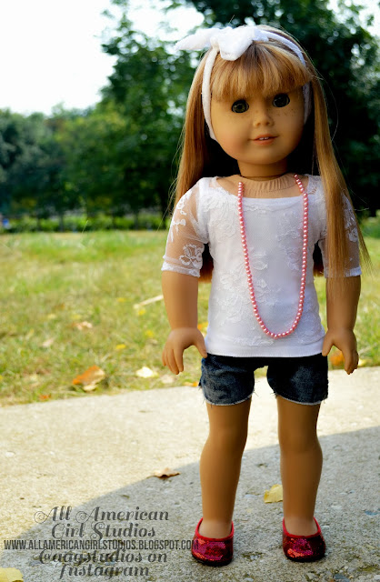
Today we are discussing some pics that All American Girl Studios sent us.
She runs the Etsy Shop Emily Heather Designs.
She emailed us the pics she wanted us to critique.
If you want us to do the same for you, please feel free to email them to nora.demington@gmail.com.
Upcoming Etsy Squares Critiques:
If you asked us to critique your Squares and don't see your shop here --
please comment below or email us.
Also, if you want to add your shop to this list of Squares to Critique -- please feel free to comment below or email us: nora.demington@gmail.com.
Here is our first Shop Critique for this Series!
For this post we'll pretend to use her pics to make an Etsy listing,
that way you can see exactly how we'd use the pics.
1) We tested a couple of the pics out and thought they looked a bit dark for our preferences. So we adjusted their exposure and boosted their color and brightness with PicMonkey.
Before Our Editing:
After Our Editing:
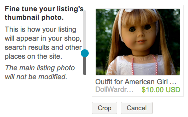
In a listing, before:
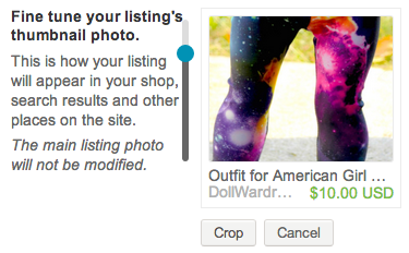
In a listing, after:
Three Etsy Squares We Would Use:
Before Our Editing:
After Our Editing:
In a listing, before:
In a listing, after:
Three Etsy Squares We Would Use:
Before Our Editing:
After Our Editing:
In a listing, before:
In a listing, after:
Etsy Square We Would Use:
Before Our Editing:
After Our Editing:
In a listing, before:
In a listing, after:
While this is a fairly nice Square,
we probably wouldn't use it because it cuts off the doll's face.
Etsy Square We Would Use:
Before Our Editing:
After Our Editing:
In a listing, before:
In a listing, after:
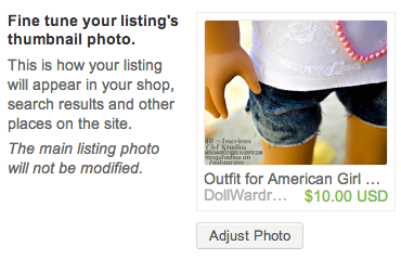
Etsy's Automatic Square placement.
We'd use this Square if we were selling the whole outfit, the hoodie,
or the hoodie and tee.
We'd use this Square if we were selling the shoes.
We'd use one of these two Squares if we were selling the leggings.
We'd use this Square if we were selling the hair accessory.
Now this photo editing is a matter of personal preferences,
but we liked the brighter boosted pics.
2) A great aspect of these pics is how they are photographed outdoors and
their backgrounds are often blurred.
This really helps make the photos pop.
Perfectly Awesome Square.
We would use this for selling the shorts.
Perfectly Awesome Square.
Great for selling the shoes and/or the leggings.
3) All American Girl Studios likes to use a logo on her pics because she shares them through social media outlets like Instagram.
She has used her "trademark" on each pic without it interfering with the aesthetic value of the images. The potential buyer can still fully appreciate the product in the Squares.
When we crafted our Squares, the "trademark" appears in some of them and
in others it does not appear at all.
As we explained to her, watermarks, logos and borders are not out of the question.
Some people use them and they look okay/aren't too distracting. Etsy does not recommend that you use them, and any image with those types of things will never make their front page of Etsy "highlighted" products/squares. But if you are worried about people taking your pics, don't hesitate to use a watermark if the benefits outweigh the cons.
If we were selling objects, we wouldn't watermark our product photos, but we don't really care if people steal our pics, haha. So personal preferences come into play here.
MegOri's Dolls started using watermarks:
or a logo -- whatever you want to call that, haha. And they aren't annoying visually. So just make sure they aren't interfering with someone's visual appreciation of the item for sale.
I wouldn't put them right across a doll's face, or right across a tee you are selling. Try to put the words/watermarks on your pics in a way that doesn't block the view of the doll/outfit too much, but yet another person can't crop the words out easily.
Another possibility you can consider is to use a logo on your products in trendy, hip and playful ways, such as the way that Liberty Jane brands many of their tees and that AG brands their outfits. There are ways to logo-ify your products without the logo being annoying to the consumer. For example:
If you have any questions or comments, feel free to let us know!!!
_________________
Up next we'll start critiquing more shops' Squares by request!
These posts will help both the shopkeeper and you!
We have had a couple requests to "critique someone's squares" --
so we will offer this service to you completely free.
But it does mean we'll post about it on here, haha.
That way our advice can help as many people as possible.
Even the shy peeps who don't ask us to critique their squares. ;-)
So if you want your squares critiqued,
comment below or email us at nora.demington@gmail.com.
We'll post about your squares and our advice and examples on how to improve them.
We have several more steps for how to Brand Your Etsy Squares to help you learn more about what types of squares we tend to click on and how to make them yourself.
We'll be working these into the Squares Critiques.
So Stay Tuned!!!


2 comments:
Hi! I asked for my Etsy shop, SodaPopStreet, to be critiqued a while back and my shop is not on the list.
Thanks,
Katie :)
Oky-doky we'll add you in. Our list got lost in the shuffle of paperwork, haha, so we weren't sure we got everybody. Thanks for letting us know!
http://www.etsy.com/shop/SodaPopStreet
Post a Comment